Since our founding five years ago, it has been our goal to provide HR solutions for time-consuming administrative tasks. As we’ve grown, our values have developed and deepened as we learned from our clients, partners, and teams.
Our slogan, “dedicate time to what really matters” was and is something that we strongly stand behind, but over time, we’ve come to see that it is too ambiguous to be our central guiding principle.
Many start-ups adopt such broad messaging to inspire change without ever specifying what changes they are setting out to make. As we evolved, this slogan, and our brand identity as a whole, felt unequal to the clarity and scope of our mission.
We envisioned our new image as something direct and accessible. A succinct message that could be easily understood, one that would not be loosely interpreted. So, we went back to the drawing board to find out what really matters to us.
Discovering the new Factorial
Starting with just 14 employees, Factorial has grown to become a team of 300. Although the expansion is exciting, it has also posed our greatest challenge: Defining a continually evolving company.
We set out to piece together all of the different visions, values, and objectives and priorities, and to understand, above all, what Factorial meant to the people at Factorial.

Creating the new Factorial identity was a huge collaborative project. Dozens of team members from every department helped us to rediscover and refine our organization’s meaning and message.
We want to empower the next generation of SMBs that put people first, providing organizations around the world with the best tools, information, and knowledge to help their people.
Setting out this shared vision and mission means that our teams can work together toward something we all believe in. Team members within the organization are empowered to make decisions independently with the knowledge that we are working toward the same common goal.
Defining an evolving identity
Our rebranding is not just about making the brand more modern or polishing our appearance. It is not a cosmetic change: it is a cultural revolution from within. It reboots, rebuilds, and reinvents.
Factorial’s founders, Jordi, Bernat, and Pau, are passionate about creating a work environment in which teams see clearly how their ideas and processes contribute directly to the mission and success of the company. Every day, they help construct Factorial anew, making it kinder, smarter, more resourceful.
Through many meetings and workshops, we saw that our brand would have to be vibrant, passionate, and dynamic, that could represent real people with big ideas. In short, we would create a more human brand.

We designed a brand identity to express this vision: to change the way companies are managed by putting people at the center.

A radical change in color
We present the new color of our brand Radical Red- a vibrant, daring, modern, and warm color. It matches our company’s boldness and expressive strength. It represents our most emotional side, our way of acting and showing ourselves to the world.
Viridian Green is our secondary brand color – the perfect complement to Radical Red. It represents our more rational side, helping us to transmit security and confidence. It also helps us differentiate our sub-brands and associations, reinforcing our more rational communications.
Factorial is much more than data, tools, insights. Factorial supports organizations in managing their workforce, improving their business, and developing talent. But what makes our product stand out is the emotional connection that allows companies to grow with their people.

We wanted the feel of our brand to reflect the strength of our product, which in the end, is its ability to connect and align people.

Factorial’s new font, Fira Sans, was selected for two reasons: legibility and personality. Our choice of text was intended to facilitate the process of reading on the screen. We wanted to allow readers to engage with the information with fluidity and ease.

A new visual universe
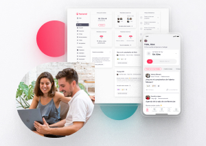
At Factorial, we celebrate authenticity and respect people for who they are. For this reason, our new photos show people on our teams acting like themselves. These images reflect authentic moments that represent the daily reality of organizations.

In the last five years, our visual universe had adapted to include a range of styles and unwritten rules. It was clear that our image was not able to keep up with the company’s rapid growth.
We took a look at the old Factorial’s visual vocabulary. Previously, we used a set of dots, using a simple, repetitive mark to create larger “shapes.” When we analyzed our previous images, we realized the repetitive use that we made with scarce visual resources.

Instead of this repetition, we wanted to create a visual vocabulary that could free people’s creativity, making simple and fun use of shapes and colors.
Users often comment that Factorial is an intuitive and user-friendly software. Our clean, clutter-free visual communication is integral to the experience of our software. We wanted to continue moving towards these aesthetics and decided to learn from design history.
Inspired by teaching models based on creativity and play, we decided to adopt the vision of the German pedagogue, former Bauhaus professor and creator of the kindergarten concept, Friedrich Fröbel.
Fröbel wanted to remove from the students what was already within them. Encouraging their apprentices to let themselves be carried away by their own creativity and to work with different shapes, lines, colors, and textures. This idea strongly attracted us and gave us the basis for our new visual vocabulary: artifacts.

With these artifacts, we can convey an entire universe of imagery and visual storytelling.

Building a brand that evolves with us
Of course, we know that the rebranding will never end. Like today’s People Teams, Factorial is always changing and evolving.
But today, Monday, October 18, we are pleased to show our new brand. Guided by the principle that humans are so much more than resources, we stand for empathetic leadership, empowerment, and dynamic thinking. We stand by (and for) the most important part of every organization: its people.